Rebranding Sushi Heaven
Bridging Heritage & Modernity | Nov - Dec 2025
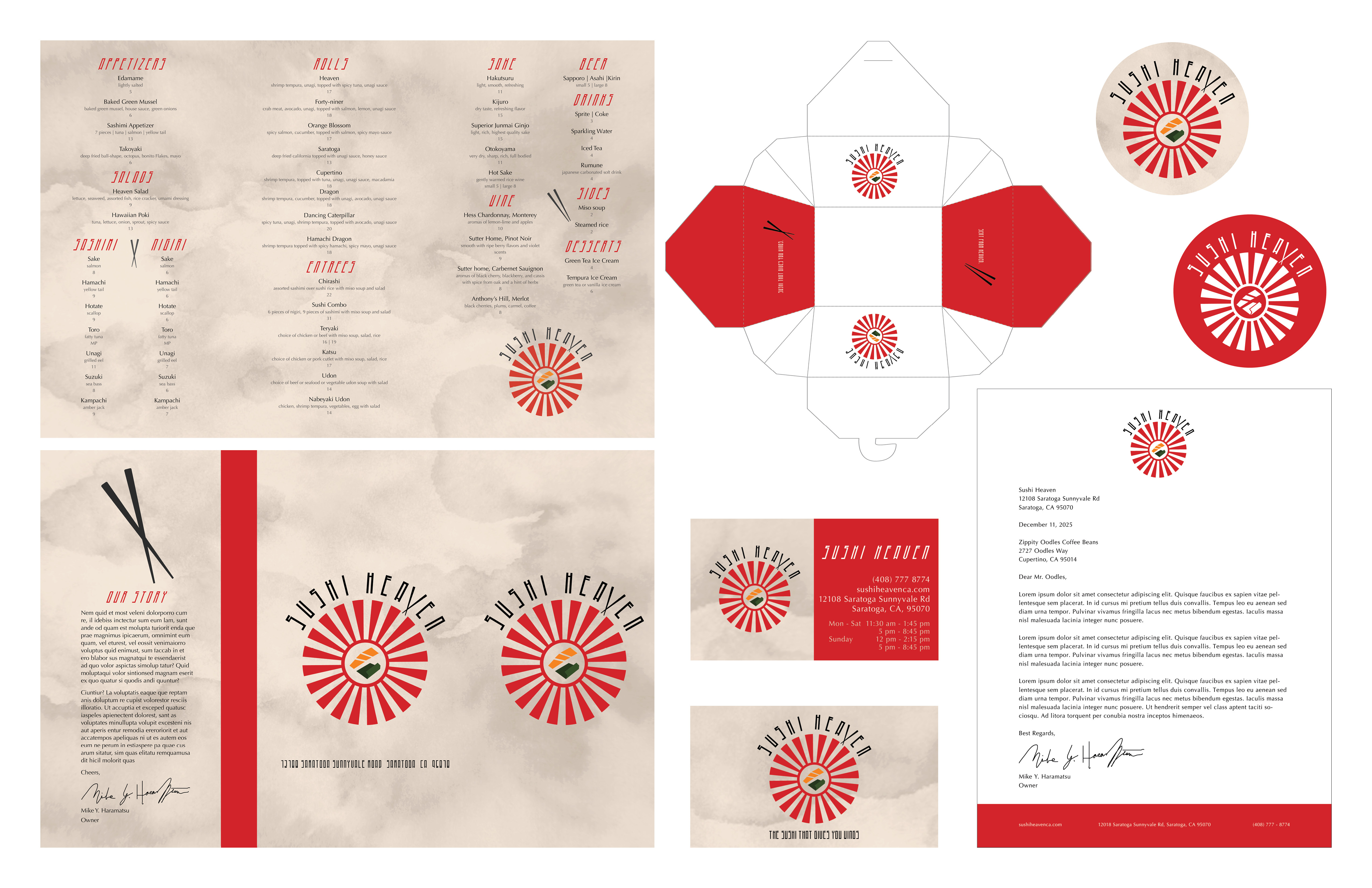
Restaurant Identity Kit
I designed a complete brand identity system for a local sushi restaurant that I enjoy and felt connected to my Japanese heritage. I created a new logo, color palette, typography, and visual guidelines using Adobe Illustrator and InDesign.
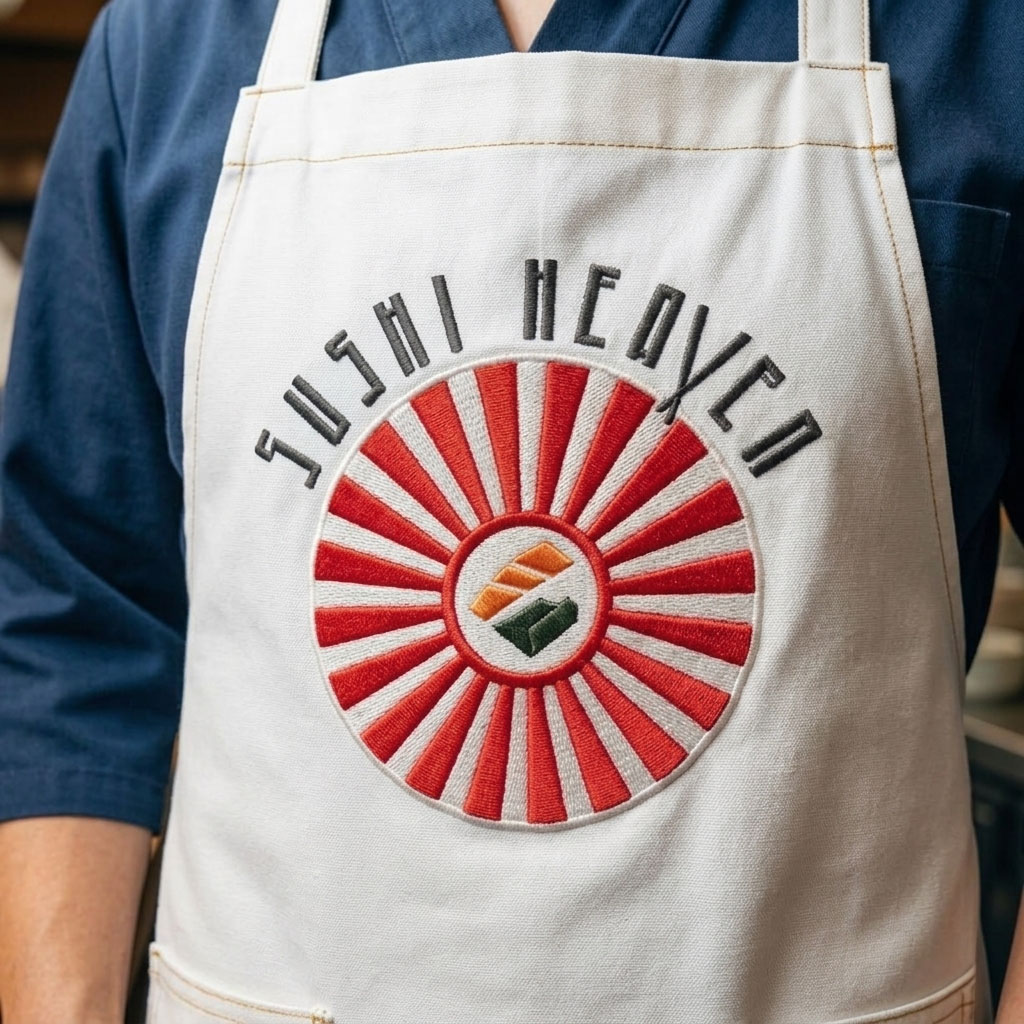
The Logo
The Process
After reasearching different represenations of "sushi" and "heaven" I started the logo as a nirgi salmon with wings with the red "rising sun" in the background. I knew I wanted red in my logo design because there is a lot of meaning behind the color red in Japanese cutlure. As I refined my logo more, I started incorporating a chopstick illustastion I designed. After experimenting with different sizing of the chopsticks, I landed with a small size similar to the shape of a "v" in the typography.
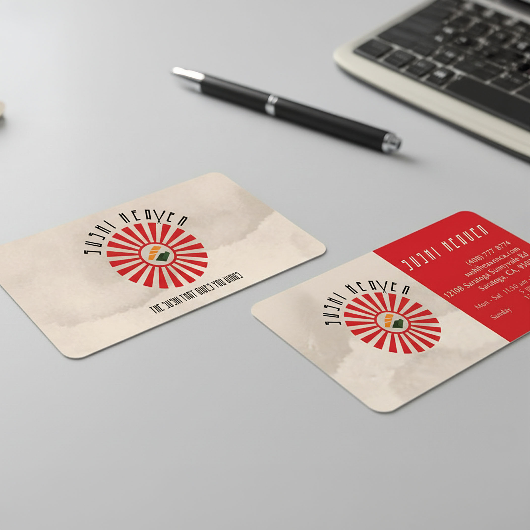
But soon I ran into a problem with my last few iterations of the logo. The sushi rice was a very light color, which was close to white. This meant I had to redesign the rice element into a different shape and color. On a suggestion, I changed the rice element into a seaweed shape. I made sure to make it geometic so it was coheasive witht he rest of the logo design. I also designed branded assets such as redesigned menu, business card, and coaster.
Logo Iterations
Final Logo
The Menu
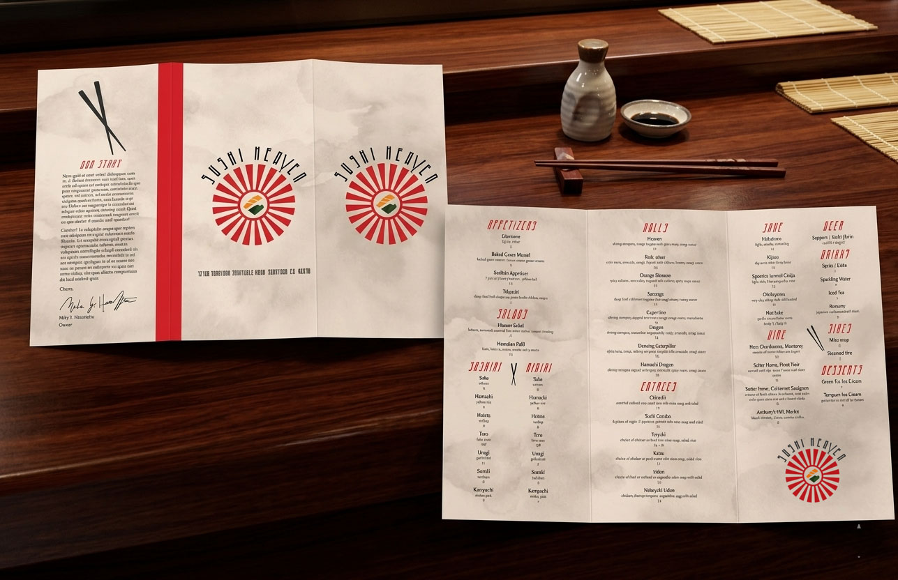
The Process
The orginal menu of Sushi Heaven was very abundant and to create a menu that felt fine dining and that felt it was an elevated experience, I included about half of the menu items. I included each menu item description to the orginal menu, but to keep the layout balanced and maintain the menu's visual asethics, I had to cut one or two words.
To elevate the menu, I inlcuded a watercolor texture to mimic traditonal paper used in Japanese culture or the shoji paper used on screen doors. I also created some chopstick illustrations in the menu to make it more interesting.
Other Assets
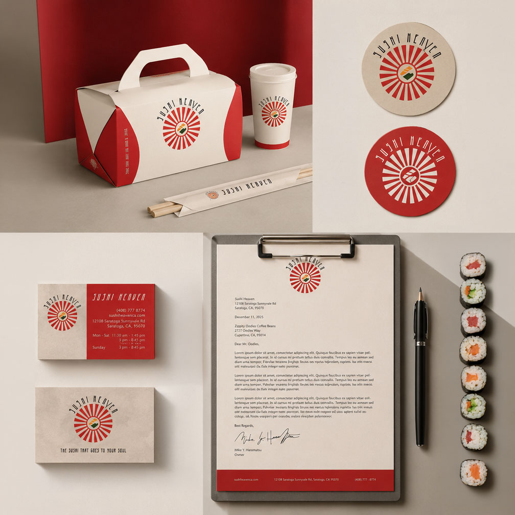
The Process
I designed other assets like a business card, business letter, takeout box, and a double sided coaster based on my design of the menu. I designed each piece so it would look cohesive by adding accents of red and the watercolor texture. Additonally, I created a knockout version of the logo for the coaster.