A Tase of Good Fortune
A Study in Brochure Design | Apr 2026
The Logo
The Process
I designed brochure for fictitious company called Sakura Heritage Soceity. Their purpose is to educate vistors or anyone interested in learning about Japanese Culture.I knew I wanted to design a circle logo because it would be unified with the geometric style of my layout. I also wanted the logo to include an illustration of a sakura flower since it was in the name of the company. I designed it in a single color red as this is a significant color in Japanese culture.
The Layout Design
The Process
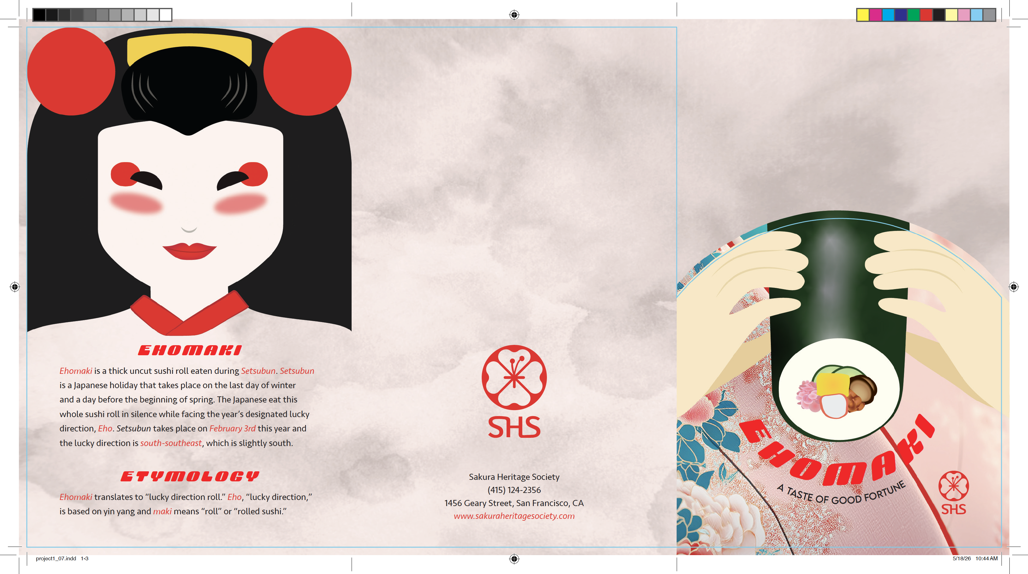
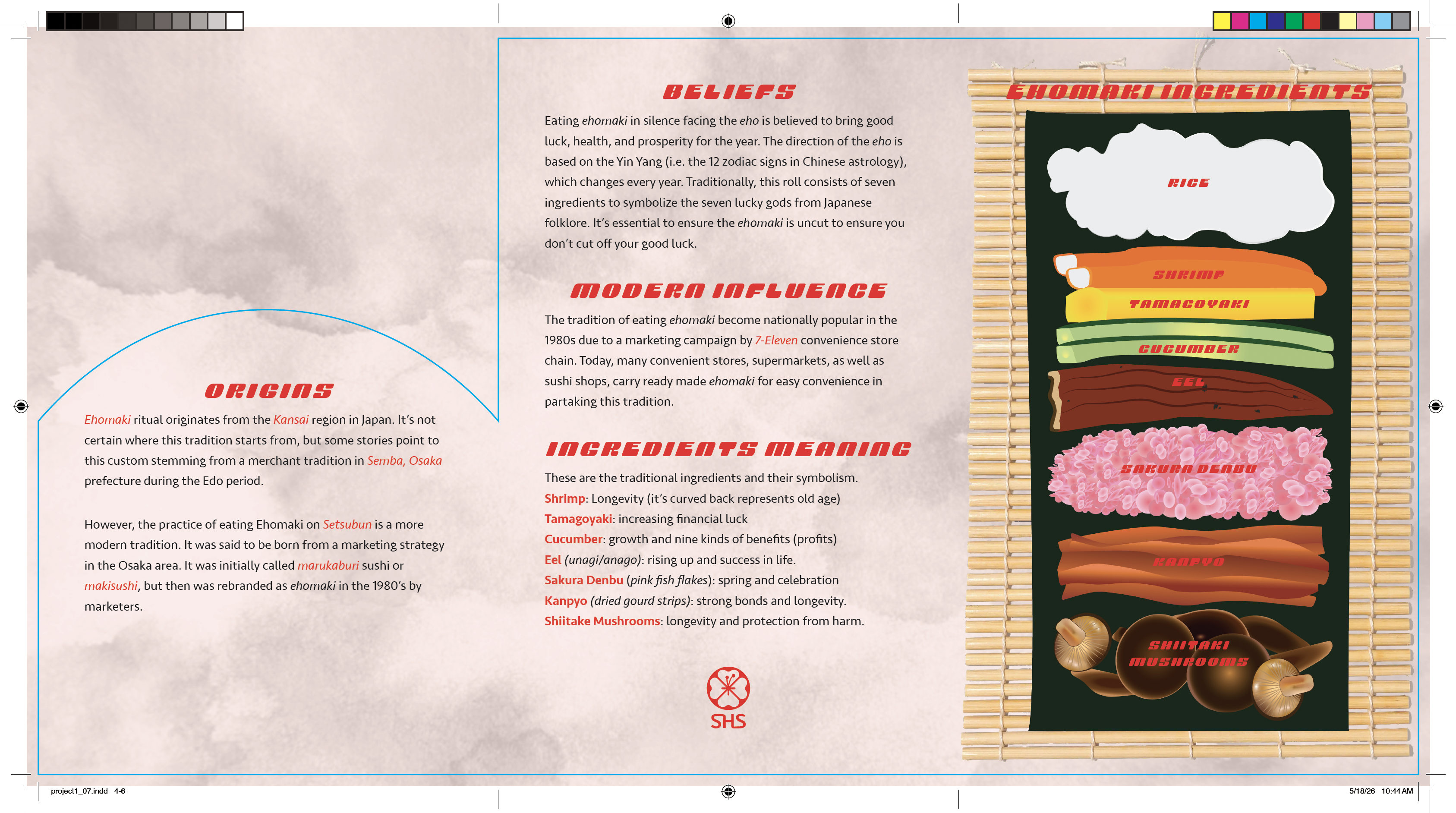
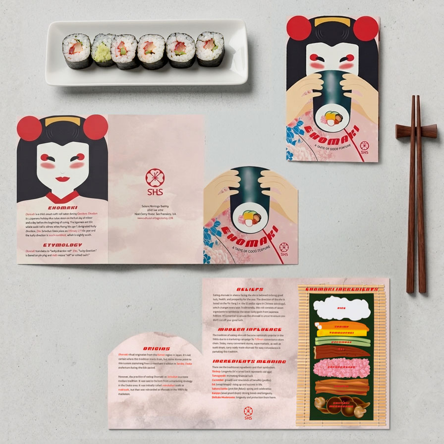
Above is my first iteration of my layout design. The second image was the final outcoome.For my selected topic, I chose to educate my target audience on a eating ritual practiced during setsubun. Setsubun is a Japanese holiday that welcomes spring and good luck for the rest of year. To bring in good luck,the Japanese believe in particpating in an old merchant tradition of eating a thick sushi roll in silence in that year's lucky direction. The Ehomaki include 7 ingredients to represent the seven lucky gods of Japanese Folklore.
I initally, designed this brochure to illustrate someone eating a ehomaki, but decided to illustrate a geisha since there's a lot of cultural meaning behind Geishas. The illustration design was inspired by Ikko Tanaka's interperation of Geishas, speciallically his poster design,"Nihon Buyo," which directly translate to Japanese traditonal dance. I initally had drawn the geisha where there was an arch cutout that match up with the cover perfectly.
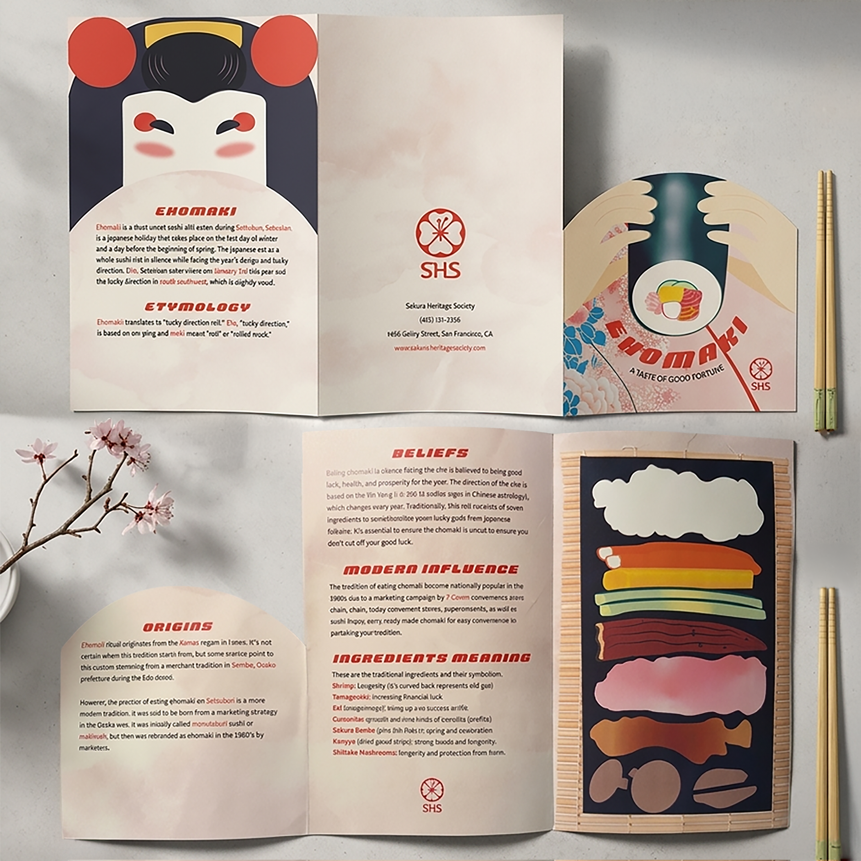
But after some feedback, I soon realized the geisha face needed to be complete because it was a big point of emphasis in my deisgn. Next, I designed some illustration of each of the common seven ingredients in the Ehomaki. I thought this would be insightful with the written section of what each ingreidents signifies. Lastly, I added some textures to elevate the design.Below are my layout designs with my dye cut.